In recent years, there has been a notable increase in demand for illuminated signs, resulting in a consequent increase in sales prices. In some cases, these prices have reached record levels, previously reserved for the world of Contemporary Art. This growing demand, driven above all by the American market, which has always been a great user of neon signs, has encouraged counterfeiters to perfect their techniques, producing replicas that are increasingly rich in details, which lead the customer to think that the piece is authentic. The situation is further complicated by the difficulty of online platforms in offering valid support to their customers regarding the authenticity of the items offered, often due to the lack of specific skills in the sector.
In this article, we will provide advice to those who are looking for an illuminated sign, but who may not have enough experience to evaluate its originality. We will use two variations of signs as examples Ferrari: a rectangular one with the writing “Assistance Service” and another made up of single letters, both known to be frequently the subject of counterfeiting.


Let's start with the “Assistance Service” version: on the left, we present an authentic example dating back to the late 1960s, in NOS (New Old Stock) condition, coming from our private collection. Although unmarked, it is likely that this particular sign was produced by Neon Modena, given that, at least until the 1980s, the majority of official plexiglass signs were made by that company. To confirm this, we report a photograph from the 1970s, taken outside Cavallari, the historic Ferrari Service in the Principality of Monaco, in which a sign identical to the one we present is clearly visible, certifying its origin and authenticity. This type of sign was made by thermoforming, using a mold owned by the manufacturer.
Curiously, despite the location of the Service in a "foreign" land, and considering that the 80% of the Monegasque population has Italian roots, the sign bore the writing in Italian, to once again underline the origin of the Maranello brand.

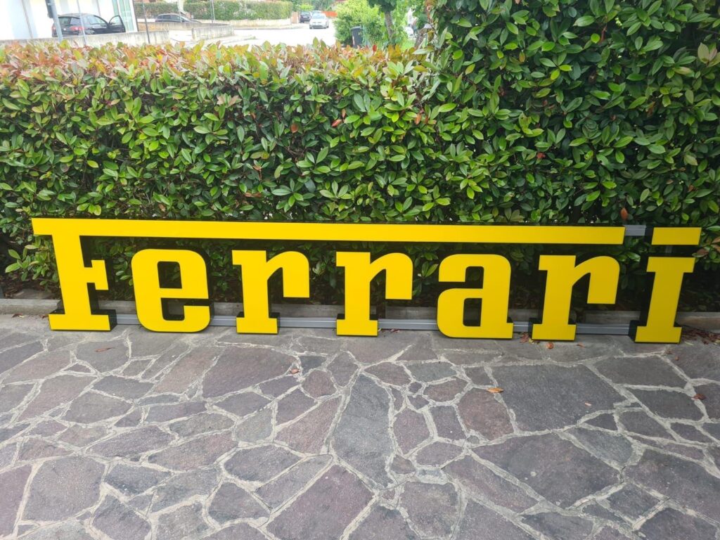
Let us now proceed to examine the reproduced sign, visible in the photo on the right, created using a modern technique in which the graphics are printed on adhesive film using a plotter and subsequently applied to a steel structure, presumably illuminated with LEDs or, if you are lucky , with neon tubes. In addition to the construction method, which can be replicated by any sign laboratory with a relatively modest investment, macro-errors are evident in the fonts, the hair and the spacing. Insignia of this type have never been used in any Official Service, neither in the past nor today.
The widespread presence of these brands on the online market should arouse suspicion, considering that Ferrari Services are still few today, and even more so in the past when the network was much less extensive. The question therefore arises spontaneously: how many of these services could abandon their brands? An even smaller number than the initial one. It is therefore legitimate to wonder how it is possible to regularly find dozens of these signs for sale, all in perfect condition. It is essential to pay attention, as many of these counterfeits feature manufacturer stickers or logos (such as Neon Modena or others) affixed without the consent of these esteemed manufacturers, for the sole purpose of misleading the less experienced. If you choose to purchase them aware of their counterfeit nature, we suggest you do so at an appropriate price, but our main recommendation is to avoid them like the plague.
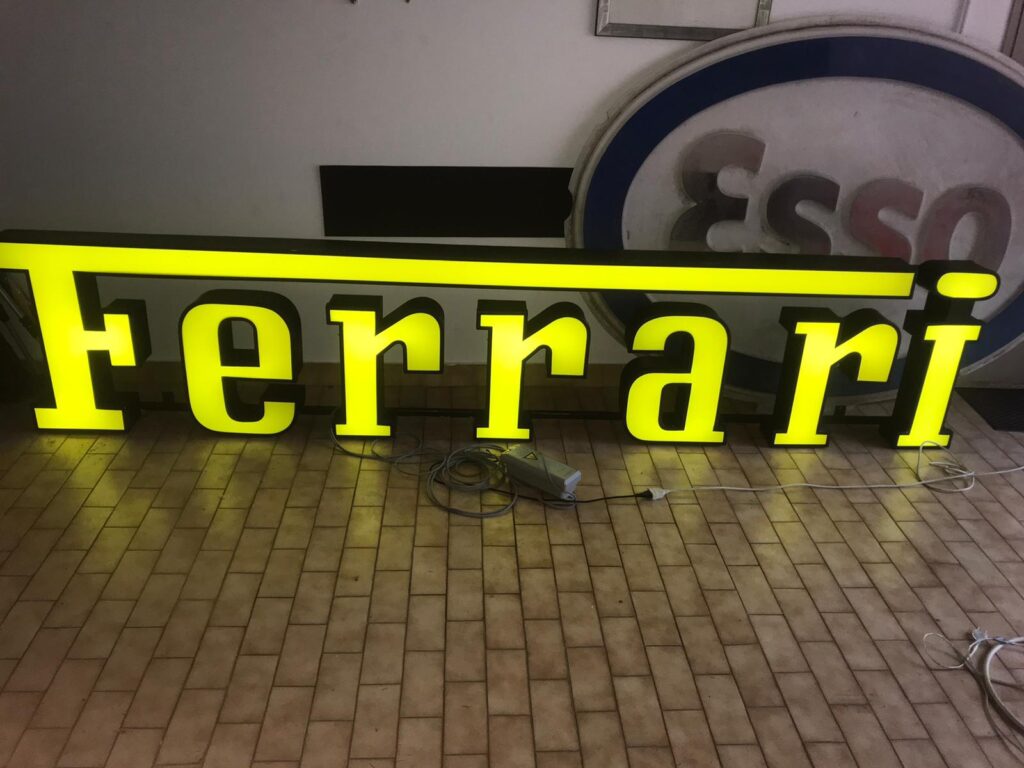
Let's now continue with the analysis of single-letter signs, which represent true icons in both the automotive and collecting worlds. In the following two photos you can observe two examples: in the upper photo, an authentic sign dating back to the mid-1990s, while in the lower photo, a rough recent reproduction.


The difference in quality in construction is immediately evident, but let's outline some of the more significant differences. First, the letter spacing in the authentic version is noticeably further apart than in the reproduced version. Another relevant aspect is represented by the letter "i" in the fake version, characterized by an unusual rectangular "dot" of considerable size, which covers the entire shape of the letter underneath. This configuration was only in use for a very short period in the 1950s and is not compatible with a modern sign.
Let us now pay attention to the manufacturing technique, where in the authentic sign we can see carefully crafted aluminium/steel boxes, in which the yellow plexiglass is set and fixed by an aluminium/steel frame. Unfortunately, these signs rarely featured manufacturer markings, as they were usually commissioned directly by dealerships from local sign makers. This is in contrast to thermoformed signs, which had centralized production due to the use of molds. However, despite this feature, the single letter signs were practically identical to each other, as Ferrari provided detailed printed information material to the dealerships, to ensure that the appearance of an Italian dealer was similar to that on the other side of the world.
As for the lighting of these signs, it was done through neon wire, i.e. thermoformed neon that followed the shape of the letters to provide lighting. Of course, over the years, it is possible that a neon has become damaged and has been replaced with more modern technology to ensure greater system safety.


The example discussed in the article was finally converted to LED, as the new owner wanted to keep the sign lit throughout the day, without jeopardizing the safety of his garage, which as you can see also houses a Ferrari 275 GTB .

We would like to point out that the sign under analysis belongs to the 1990s, but over the decades several changes have been made to the font, consequently also reflecting on the signs. In order not to excessively prolong the discussion, we will limit ourselves to presenting you with an example from the 1980s. In this way you will be able to appreciate the difference in the font, which is mainly highlighted in the letter "i" with its characteristic overwritten dot, now oval in shape, and in the serifs of the letters "r".


If you have any curiosities or questions, we invite you to share them in the comments below the article.
Happy Collecting everyone!
Gianmarco Siciliano – CEO

Leave a Reply